Turning the corner
A Bay of Plenty renovation trades three corner cupboards and a walk-in pantry for a generous island, natural stone and herringbone underfoot.
Every kitchen carries the fingerprints of its era, and those of the early 2000s favoured the angle — benches folded into a G, corners cut at 45 degrees, a walk-in pantry wedged into the bend. This Bay of Plenty home, bought by its new owners with an upgrade already in mind, was a faithful example of the type.
The task of reimagining its living spaces fell to Chelsey Mathieson, Certified Kitchen Designer and founder of Niche Design Co, whose ‘Design to Completion’ service would carry the work from first plan to final fitting.“The existing kitchen was a typical design for the era of the home, with a large corner pantry, no benchtop space around the hob, and mainly cupboards throughout rather than drawers,” she says. “Being G-shaped, with 45-degree angles, there were also three corner cupboards making up a large portion of the storage space.”
The owners arrived with a clear picture of how the room should feel. Chelsey’s part was to find the plan beneath it, within walls that would stay where they stood. “The challenge was to create a kitchen that felt more open, considered and connected to the living spaces, while also significantly improving its functionality,” she explains.
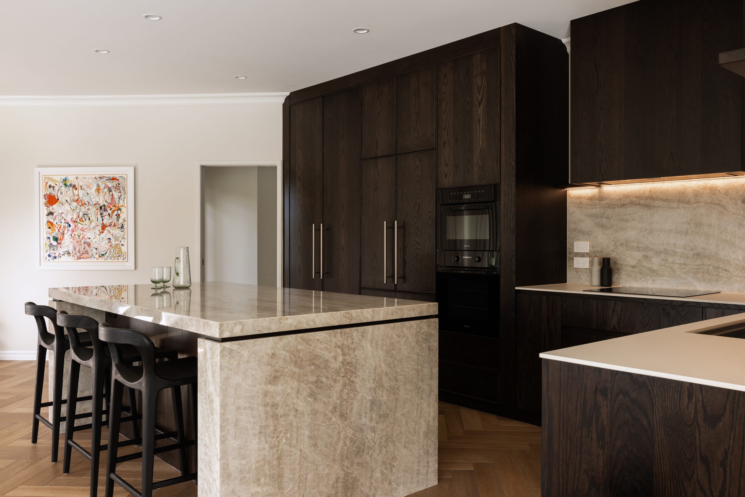
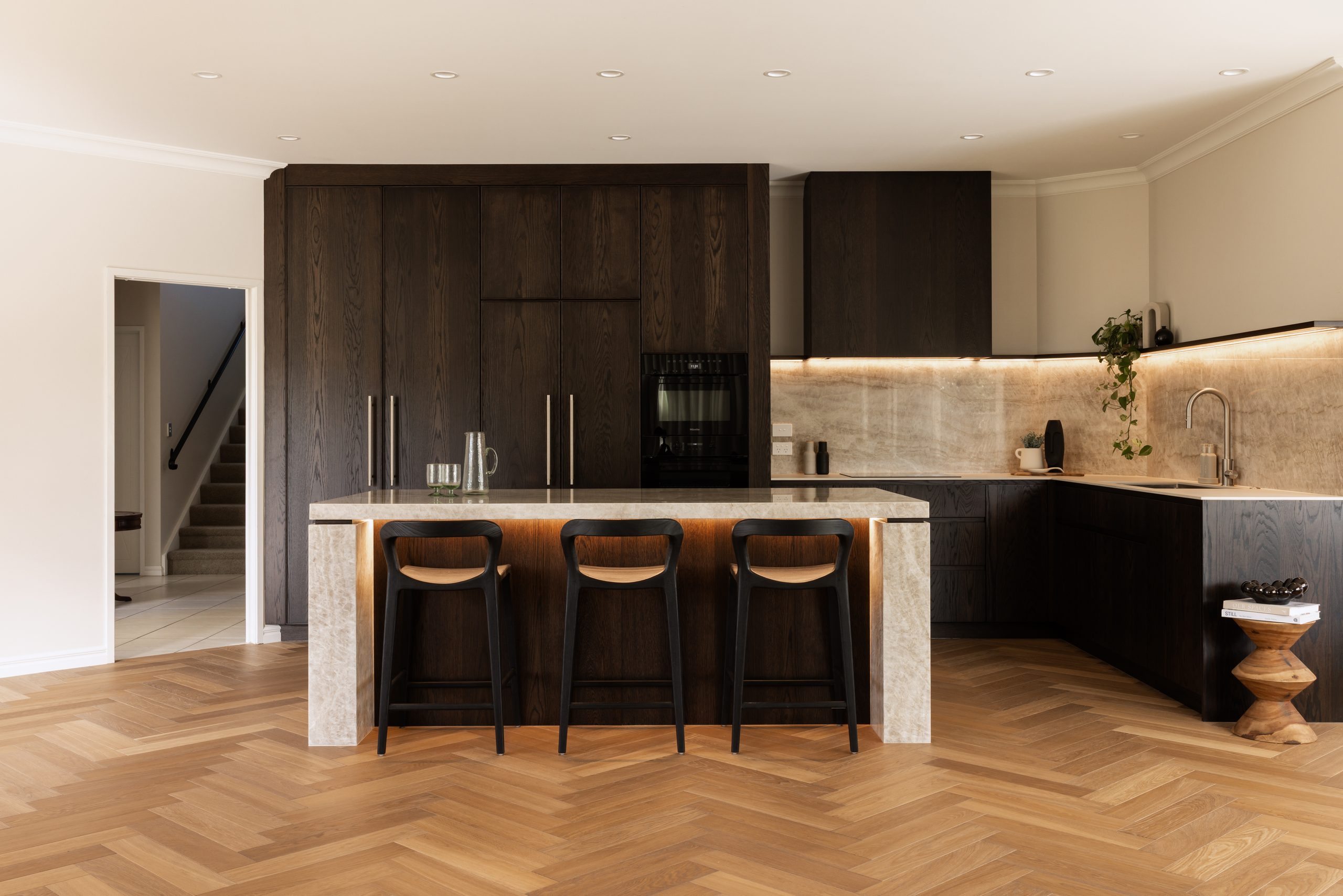
Her solution was to give the room a centre. With the space opened up, a larger island now sits at the heart of the kitchen, where preparing and serving happen in full view of the living areas and the two halves of the home finally speak to one another. The sink, once stranded on the servery, found a new place on the end wall, an easy turn from the hob.
Along the back wall, the kitchen’s working parts were gathered into a single, tall composition. “I used the entire back wall for the tall elements, including the pantry, fridge and wall ovens,” says Chelsey. “This allowed us to consolidate the bulk of the food storage into one area and, importantly, eliminate the awkward corner pantry that had previously dominated the space. Opening up this corner gave us the opportunity to create a much more functional working zone, with the hob and sink positioned within close working proximity.”
It is a decisive piece of planning. The corners that once held so much of the kitchen are gone, the storage stands together in one full-height run, and sink and hob now work as a pair. Within the cabinetry, Blum hardware goes about its work out of sight, while Tasman Plumbing Contractors, part of the team of trades Niche Design Co coordinated through the build, brought the services to the sink’s new position.
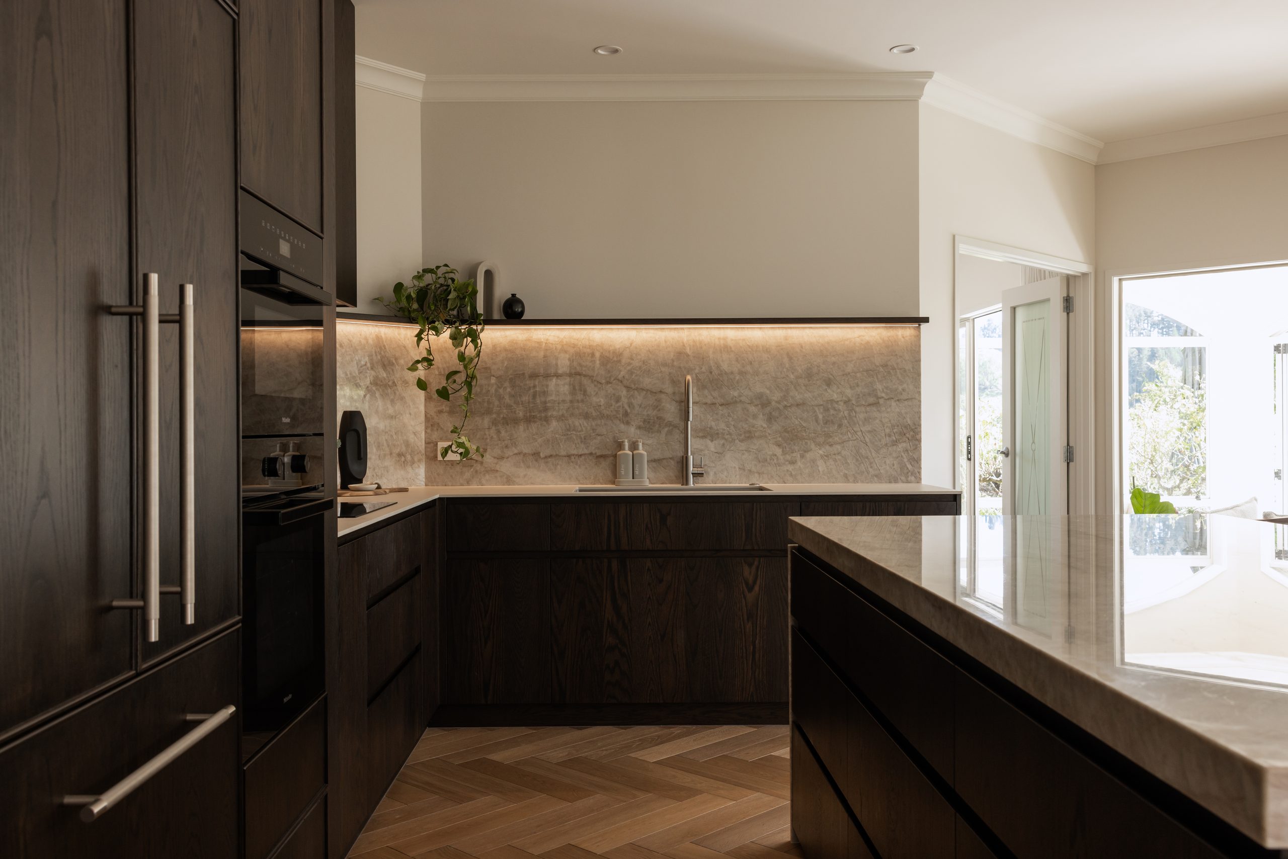
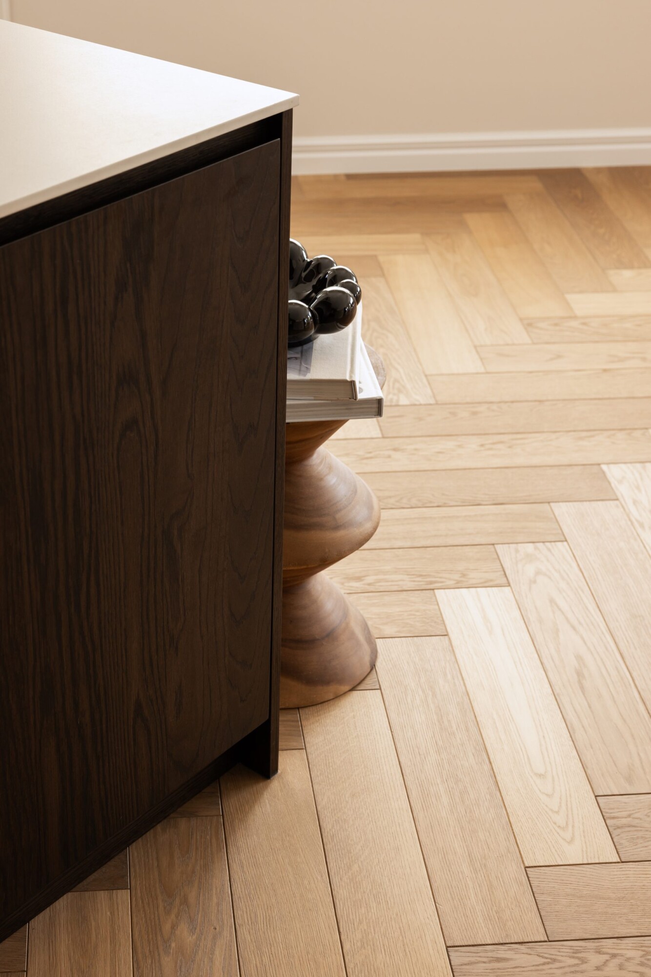
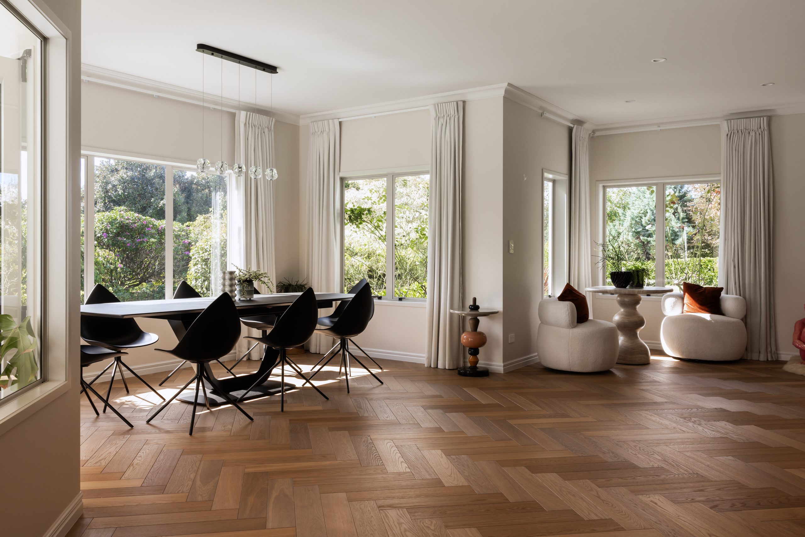
Materially, everything began with the floor. The owners had fallen for VidaSpace’s ‘Fendi Herringbone’, and Chelsey let it lead. Laid by Abstract Floors, its interlocking pattern brings warmth, texture and a sense of movement, a natural thread running beneath the whole room.
Above it, natural stone takes the stage. Cosentino’s Sensa quartzite in ‘Taj Mahal’ dresses the island and splashbacks, its soft veining wandering freely where the floor keeps strict time. “The softer, more organic movement of the stone contrasts beautifully with the linear herringbone flooring,” says Chelsey.
Around the sink and hob, where the kitchen works hardest, she chose Dekton in ‘Aeris’, supplied by Mount Maunganui stone specialists Top Stone. “It’s a highly practical surface that could withstand the demands of these high-use areas, while allowing the Taj Mahal to remain the hero material,” she explains.
Her favourite detail arrived by a different route. The design first included a floating shelf above the sink in the same Taj Mahal, but in a long, relatively narrow format, the strength and durability it needed proved hard to achieve in natural stone. Rather than compromise, the team rethought the material and built the shelf in a dark timber veneer to match the cabinetry.
“The dark timber veneer ties the cabinetry into the space and creates another layer of warmth against the Taj Mahal stone,” says Chelsey. “It has become one of my favourite details in the kitchen, and a great example of how sometimes the best design solutions come from having to rethink the original idea.”
Moments like this are where the in-house model earns its keep. “Renovations can often present unexpected challenges, so having a strong team who communicate well and work collaboratively is key,” she says. “It allows us to problem-solve quickly.”
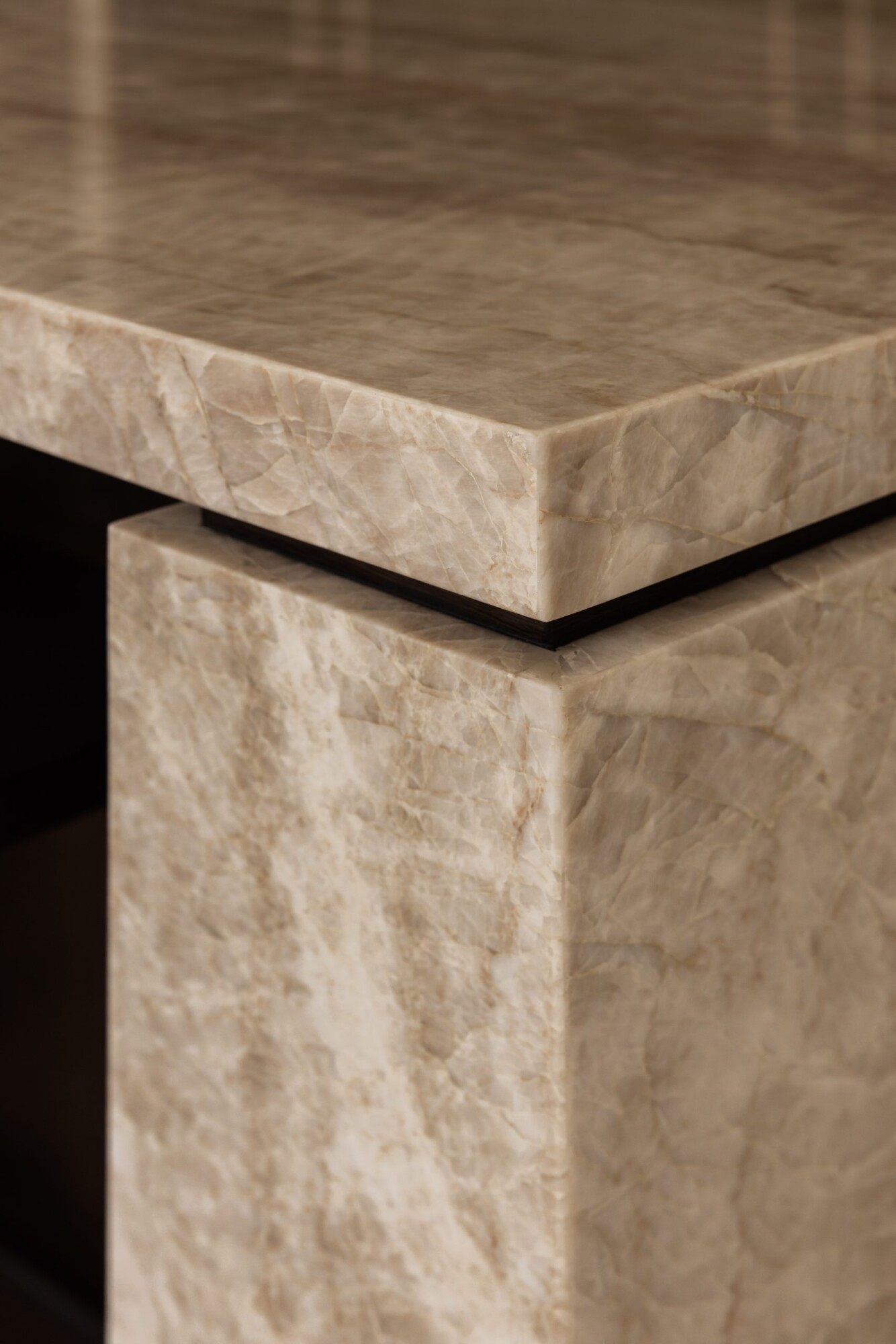
That timber thread continues through Inspace Cabinetry’s joinery, whose darker tones give the kitchen its depth. “With the darker cabinetry and stone, it could have easily become a heavy or dark space,” Chelsey says. Her answer lies in the details that only show themselves up close — narrow timber beads, subtle negative detailing and carefully considered lighting. “On closer inspection, it’s the finer details of the design that really elevate the space. They add layers of interest without competing with the overall material palette.”
Seeing those details survive from drawing to finished room is the point of designing to completion. “Being involved from the initial design through to the completed renovation allowed us to have control over the finer details,” says Chelsey. For the owners, it meant a single point of contact from start to finish.
The result is a kitchen that carries a dark, rich palette with ease: warm underfoot, softly veined at its centre, and lit so that nothing feels heavy.
Contact details
Niche Design Co
021 146 8455
chelsey@nichedesignco.nz
Images by: Untitled Studio - untitledstudio.co.nz
Website: https://www.nichedesignco.nz